不论是目标区域测序还是外显子组测序还是全基因组测序之后,我们会关注目标区域在特定深度下的覆盖度。比如20X的比例,50X的比例。如果只计算特定深度的覆盖度,我们了解不到其他深度下的覆盖度情况。如果每个都列出来,又不直观,这个时候用图片来表示就非常直观了。

获取统计数据

我们需要知道在每个深度下碱基的比例,这个时候强大的bedtools就出场了。

bedtools coverage -sorted -hist -g genome.file  -b  samp.bam -a target_regions.bed ' grep ^all > samp.hist.all.txt

-hist是为了获取目标区域的总结信息,以all开头,输出每个每个深度下碱基的比例,所以后续用grep ^all来过滤。

-sorted可以节省内存,但需要通过-g跟genome file来指定染色体的顺序。

genome file可以通过awk -v OFS='\t' {‘print $1,$2’} genome.fa.fai > genome.file 得到。

假设我们得到了smp1.hist.all.txt、smp2.hist.all.txt、smp3.hist.all.txt、smp4.hist.all.txt、smp5.hist.all.txt、smp6.hist.all.txt、smp7.hist.all.txt、

作图

 1
 2
 3
 4
 5
 6
 7
 8
 9
10
11
12
13
14
15
16
17
18
19
20
21
22
23
24
25
26
27
28
29
30
31
32
33
34
35
36
37
38
39
40
# Get a list of the bedtools output files you'd like to read in

print(labs <- paste("", gsub(".hist.all.txt", "", files, perl=TRUE), sep=""))


# Create lists to hold coverage and cumulative coverage for each alignment,
# and read the data into these lists.
cov <- list()
cov_cumul <- list()
for (i in 1:length(files)) {
    cov[[i]] <- read.table(files[i])
    # The value should be 1 at 0X.
    cov_cumul[[i]] <- 1-cumsum(c(0,cov[[i]][,5]))
}

library(RColorBrewer)
cols <- brewer.pal(length(cov), "Dark2")

# Save the graph to a file
png("target-coverage-plots.png", h=1000, w=1000, pointsize=20)

# Create plot area, but do not plot anything. Add gridlines and axis labels.
plot(cov[[1]][2:401, 2], cov_cumul[[1]][1:400], type='n', xlab="Depth", ylab="Fraction of capture target bases \u2265 depth", ylim=c(0,1.0), main="Target Region Coverage")
abline(v = 20, col = "gray60")
abline(v = 50, col = "gray60")
abline(v = 80, col = "gray60")
abline(v = 100, col = "gray60")
abline(h = 0.50, col = "gray60")
abline(h = 0.90, col = "gray60")
axis(1, at=c(20,50,80), labels=c(20,50,80))
axis(2, at=c(0.90), labels=c(0.90))
axis(2, at=c(0.50), labels=c(0.50))

# Actually plot the data for each of the alignments (stored in the lists).
for (i in 1:length(cov)) points(cov[[i]][2:401, 2], cov_cumul[[i]][1:400], type='l', lwd=3, col=cols[i])

# Add a legend using the nice sample labeles rather than the full filenames.
legend("topright", legend=labs, col=cols, lty=1, lwd=4)

dev.off()

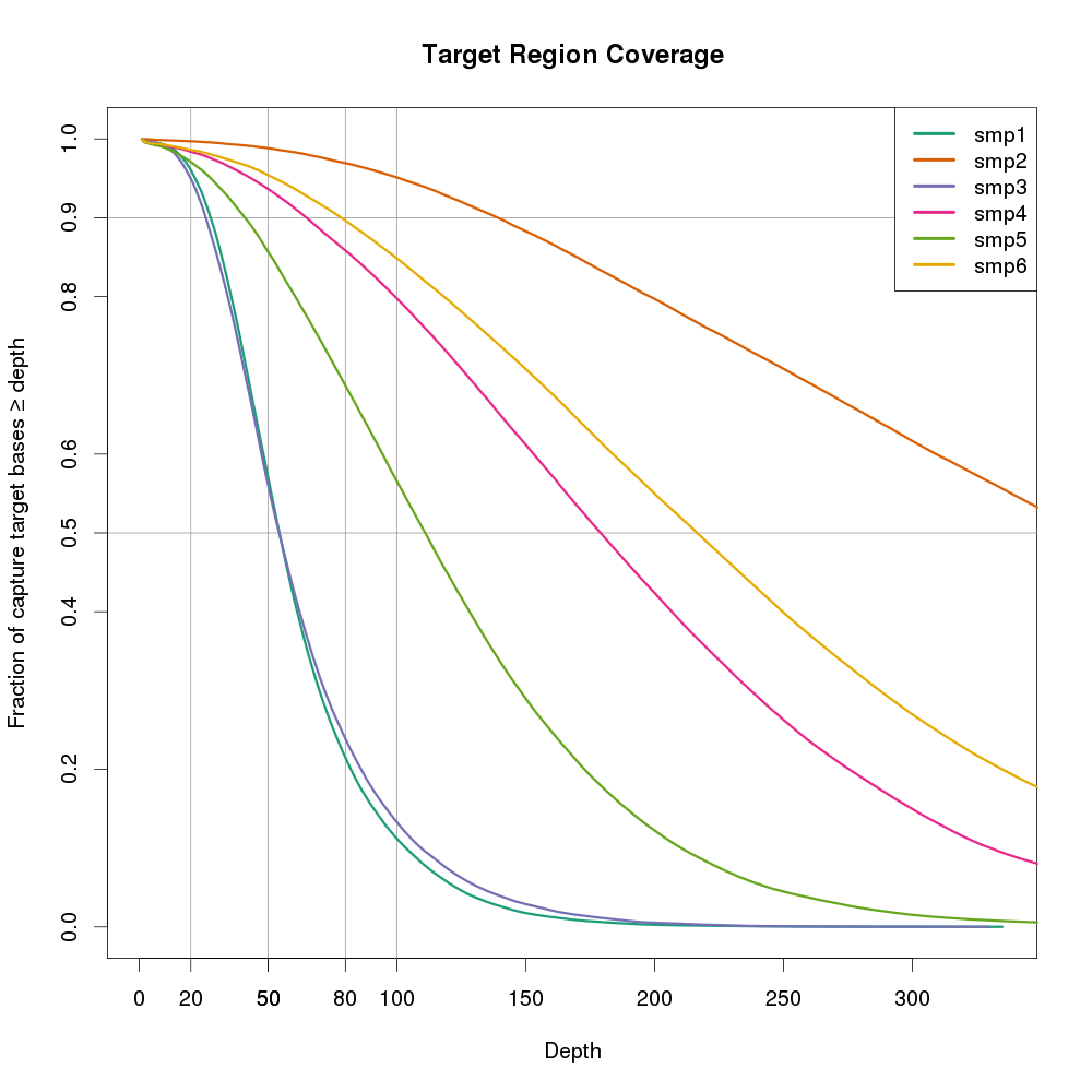
图片也可以用ggplot2来做。横坐标是DP,纵坐标是大于等于>=该DP的碱基比例。该图还有一个好处,是可以多个样本同时放在一张图上,便于进行样本间比较。

可以看出smp2的覆盖度最好,随着横左边的增加,下降最缓慢。smp1和smp3最不好,在20X以后,覆盖度显著下降。如果样本smp来自不同的测序实验,则smp2所用的方法是最有的。

最后还是那句话,图片表达的信息量多而且直观。让我们用图片说话。

主要CLONE参考:

http://www.gettinggeneticsdone.com/2014/03/visualize-coverage-exome-targeted-ngs-bedtools.html

####################################################################

#版权所有 转载请告知 版权归作者所有 如有侵权 一经发现 必将追究其法律责任

#Author: Jason

####################################################################